“Rules are meant to be broken” is an axiom often used by entrepreneurs, politicians, and fashionistas as justification for bending traditional practices to fit an alternative vision. Contrary to popular belief, however, being a nonconformist, when it comes to presentation, isn’t a smart course to follow if your product is a screenplay you’re hoping to sell.
In my work as a film industry consultant, hundreds of scripts cross my desk annually. Many of them are penned by writers, of all ages and skill levels, who have decided to write a movie based on the misconception that it must be pretty easy because (1) even mind-numbingly horrid stuff gets made and (2) the stuff that’s great always looks so flawless.
For every plot with a faint glimmer of originality and promise, however, there are just as many more that get rejected from the first page because their authors either didn’t bother to learn the basics of proper formatting or—to paraphrase the inimitable Captain Barbossa in Pirates of the Caribbean—assumed that industry standards are more like guidelines than actual rules.
To compete successfully in this market, there’s no excuse for improvisational layouts. Even if you can’t afford snazzy screenwriting software like Final Draft, there are enough Internet resources, books, and downloadable free scripts to make the projects you submit to contests, agents, and prospective producers look as professional as possible.
PAPER, FONTS, AND MARGINS
Your screenplay pages should be printed in black ink on one side of 8 1/2 x 11-inch white bond paper, with 1-inch margins on the top, right, and bottom sides and a 1.5-inch margin on the left. Use Courier 12 pt. font throughout the entire document. There are no headers or footers with the exception of page numbers placed in the upper right-hand corner.
Although this set up is clearly among the easiest steps associated with screenplay formatting, you’d be surprised how many newbies ignore them and commit the following sins:
- Bright fluorescent paper
- Multiple fonts and sizes
- Quirky fonts like Boopee, Sybil Green, Narkism, and Rockwell Extra Bold
- Different ink colors
- Printing on both sides of the paper
- Chatty margin notes
I think the worst I’ve seen, though, was a wannabe screenwriter who cut out movie stars’ faces from People magazine and taped them throughout her script, so I’d know how she thought her production should be cast.
ELEMENTS
Screenplays are comprised of master scenes, character names, dialogue, action, and transitions; and each of these elements is assigned a specific slot on the page. The reason for this placement precision is that—if done correctly—one page of script translates to one minute of film. On average, printed screenplays are one hundred ten pages in length, which equals a one hour, fifty minute movie.
The page/minute ratio gets radically skewed, however, if a writer uses anything other than the defined font and margins or puts elements wherever she wants. This typically happens in contests where entrants are instructed to submit their first fifteen pages, but attempt to cheat by shrinking the margins to ½-inch and using 9 pt. Arial Narrow font. Insider tip: these scripts get tossed without being read.
Here’s a brief breakdown of where things go:
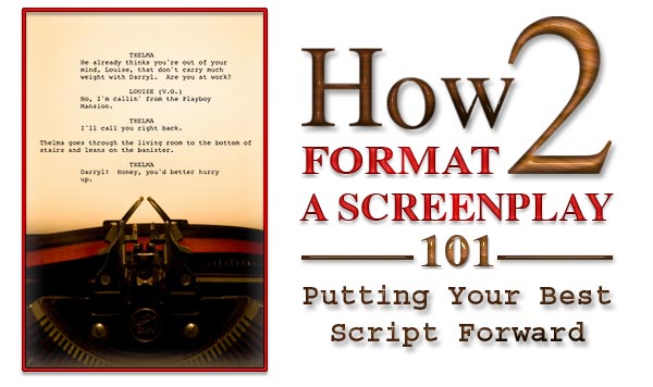
Master scenes and action descriptions are placed at the left margin (also known as the left slug line). Scene transitions such as DISSOLVE, CUT, and FADE TO BLACK are placed at the right margin. If a page were folded vertically into thirds, the dialogue blocks would (approximately) occupy the center column with each speaker’s name centered in caps above his or her lines. Elements are single-spaced with double-spacing to separate them from whatever element follows next. Verbal and facial cues, which should be used sparingly, are placed in parentheses on a separate line between the name and dialogue.
EXAMPLE:
INT. CABIN – MORNING
Jane looks out in dismay at the pouring rain.
JANE
Shouldn’t have left those sheets
on the line. Didn’t I tell you this was
going to happen?
MARISSA
(peevishly)
And didn’t I tell you I’m not your
personal servant?
DISSOLVE TO:
The more screenplays you read, the easier this format will be to understand. It’s challenging—although not impossible—to replicate the correct layout in Word by setting your tabs at:
- 2.5-inch for dialogue
- 4.0-inch for character names
- 3.2-inch for parentheticals
- 6.0-inch for parentheticals
Dialogue blocks shouldn’t extend beyond the 5.5-inch mark and are left-aligned, not centered. Nor should any of a script’s content be right justified.
Script samples provided on websites such as Scriptologist and Hollywood Lit Sales can assist you in creating a Word template. Likewise, you can download free screenplays for study from resources such as Simply Scripts, Script-o-Rama, and Screenplays For You. Note: A “shooting draft/script” or a “transcription” is not the same as one prepared in Final Draft or some other screenwriting software and accordingly, should not be followed as an accurate model.
CHARACTERS
Each time someone new is introduced to the story, his or her name appears in CAPS followed by a generic age range in parentheses. Thereafter, the names are in upper and lower case letters.
EXAMPLE:
CHLOE (20s) emerges from the taxi.
Malcolm looks up in confusion as Chloe approaches him.
Unlike a theatrical script that lists all the players upfront, film characters are introduced as they arrive in the storyline. Unlike a novel, any backstory, personality traits, or “inner thoughts” should only be included if they’re filmable—that is, easily conveyed to an audience through dialogue or action.
Likewise, screenwriting is all about brevity, not pages and pages of explicit details. Character, costume, furniture, and set descriptions should, therefore, be kept to a minimum. For instance, unless a character’s hair style or clothing color will be referenced in dialogue or is pertinent to the plot, such decisions are the purview of the director—not the writer.
DIALOGUE
“Real” life dialogue differs from “reel” life in that the latter doesn’t have time to waste on superfluous chatter. If a monologue or conversation doesn’t reveal character or advance the plot, it doesn’t belong there. Period.
Unfortunately, new screenwriters tend to use dialogue as a device to explain things to the audience that the characters, doing the talking, presumably already know.
EXAMPLE:
ELEANOR
Why if it isn’t my younger sister,
Celeste, who has been living down the
street for the past two years at our
parents’ house because her husband,
Jerry, has been unable to get a job to
support her and their two children,
Betsy who is four and Billy who is
still a toddler.
Newbies are equally guilty of having characters converse with one another in chunky paragraphs versus short, snappy lines. This slows down the pace of the read and makes everything look like a speech. The less white space on a page, the more inclined an agent or director will think the writer would be better suited to penning novels.
Other mistakes to avoid:
- Using ellipses (…) instead of dashes (--) to indicate interrupted lines
- Writing lines that are too long to be delivered in one breath
- Expecting actors to ad lib
- Using copious voiceover narration to explain the plot or character motivations
- Using italics, bold, and underlining
- Having characters keep repeating each other’s names during conversations
- Writing lines that read fine in print but sound stupid when spoken aloud (i.e., “Running Bear will keep you safe.”)
- Not recruiting friends to read dialogue out loud to see if it sounds natural
SCREEN LINGO
Screenwriting has a language of its own—a sort of shorthand to convey what the camera is looking at. If, for example, a character is heard but not seen, the abbreviations V.O., O.S., and O.C. appear in parentheses after his name to respectively indicate voiceover, off-screen, and off-camera.
As you study downloaded scripts, you’ll also run across some of the following:
- CU (close-up)
- ECU (extreme close-up)
- POV (point of view)
- PAN (a horizontal sweep)
- INTERCUT (used to simultaneously show two different locations)
Knowing film terminology, however, isn’t carte blanche to use it excessively. If you do, it’s called “directing on paper,” and this isn’t a good thing. Like descriptions, camera directions should only be used if their omission would skew the intent of a scene. To learn more about screenwriting abbreviations, Screenwriting for Hollywood has a helpful vocabulary tab.
COVERS
Back when you were in school, you probably figured out that an ultra-fancy cover for essays and term papers scored you extra points. Not so with Hollywood scripts. This is an industry where presentation conformity is expected. Specifically, completed scripts are three-hole punched on the left side, sandwiched between cover stock (in white, cream, light grey, or light blue) used as the front and back page, and held together with one-inch brass brads, so they can easily be taken apart and photocopied.
The title of a script is centered on the page with your name directly beneath it. (The title, by the way, shouldn’t appear anywhere on the script itself.) Place your address, phone number, e-mail, and website in the lower right-hand corner.
While this seems like a simple enough procedure to follow, writers often expose themselves as beginners by committing the following mistakes:
- Submitting scripts in binders, using industrial strength staples or having them spiral-bound.
- Including logos, artwork, or photographs. (I once received a cover featuring a scanned photo of Chippendale models. It had absolutely nothing to do with the plot, so I’m pretty sure it was just to get my attention.)
- Using the phrase: “An original screenplay by_________”. Readers are already assuming your content is original, so this declaration is unnecessary.
- Putting a U.S. Copyright notice/symbol or Writers Guild of America (WGA) number on the cover. Although your material should always be registered with either entity prior to submission, this shouldn’t be displayed on your work. It makes you look like a paranoid rube.
- Using the words: “Draft No._____”. This suggests you’re still regarding your script as a work in progress.
- Indicating a completion date on the cover. If, for instance, you wrote it back in 1991 and are still shopping it, the assumption someone will immediately make is that it’s probably not very good if no one has grabbed it up by now.
- Using the phrase: “Based on a True Story”. Even if it is true, it’s generally interpreted by consultants like me to mean, “You really, really have to like this because it really, really happened.” Though truth is indeed stranger than fiction, truth—particularly catharsis—isn’t synonymous with marketability. If you absolutely have to divulge this at all, save it for your final page after FADE TO BLACK.
FINAL NOTE
As with any form of writing you want to sell, it’s essential that it be as bulletproof as possible. This not only means thoroughly proofreading it yourself, but recruiting others to ensure you haven’t missed anything.
This doesn’t just apply to spelling and grammar, however. Your prospective readers are sticklers for continuity. If over the course of a story your heroine’s eyes inexplicably change from brown to green, an erudite British professor suddenly embraces a Jersey accent and slang, or your various characters age inconsistently with the plot’s passage of years, it’s going to stand out to someone reading your script for the first time.
With enough already at stake to get someone to say “Wow!” about your premise, the last thing you need is a reaction of “Huh?”Using the phrase: “Based on a True Story”. Even if it is true, it’s generally interpreted by consultants like me to mean, “You really, really have to like this because it really, really happened.” Though truth is indeed stranger than fiction, truth—particularly catharsis—isn’t synonymous with marketability. If you absolutely have to divulge this at all, save it for your final page after FADE TO BLACK.
***

Former actress/director Christina Hamlett is an award-winning author, ghostwriter, and professional script consultant whose credits to date include twenty-six books, one hundred thirty-two plays, five optioned features, and hundreds of articles and interviews. Additional information can be found at www.authorhamlett.com.
Christina is also an instructor for WOW! Women On Writing. She teaches two popular courses: See You at the Movies: An Introduction to the Craft of Screenwriting, and All the World’s a Stage: An Introduction to Playwriting. Visit WOW’s Classroom Page for more information and class availability.