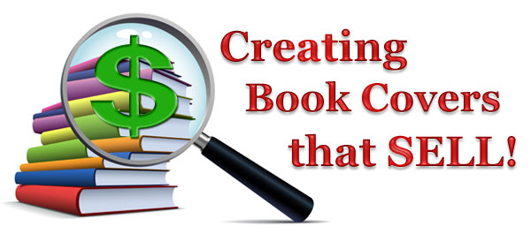
Did you know that your book cover has to do more than just look good?
The ultimate purpose of your book cover is to help sell your book. In fact, your book cover is one of the most powerful sales tools you’ll have. As a sales tool, your book cover should:
- grab the reader’s attention and imply a promise to entertain, inspire, teach, or motivate.
- make the reader want to know more about your book.
- reflect a level of quality that assures the reader that your book is worth her time and money.
If your book cover accomplishes all of the above, it will help create book sales.
So how does one turn a book cover into a powerful sales tool? Effective cover design is the key.
Effective cover design is both an art and a science. It is the calculated and market-tested combination of title, images, fonts, colors, and descriptive wording. Every element of the cover is an accurate reflection of the words written inside. The cover sets a tone that entices the reader into accepting the experience that your book promises to deliver.
I randomly selected two books from Amazon to help explain why one book works very well as a sales tool, and the other does not.
Perfect Fudge

Book description:
Sam is horrified to find herself kidnapped by a bunch of strangers—people stranger than anyone she ever met before. She doesn’t care that they claim to have saved her from death. Or that they call themselves angels. Guardian angels. All that matters to her is that they won’t let her go, but insist she stays with them. Forever. And then it gets even worse. As time passes, Sam is faced with decisions and choices full of hurt and anguish, and she is sure of only one thing . . . that nothing will ever be the same again. A story about friendship and love, about commitment and happiness, and a girl who never thought anything out of the ordinary would ever happen to her.
This is a young adult (YA) book about a young girl who is kidnapped by a strange group of people that call themselves angels. (Read book description above.) The author has been gracious enough to give me permission to pick apart her cover. My comments are not reflective of the quality of her writing. I’ve read a sample of her book. It’s really quite good and has received plenty of positive reviews! All that’s left is to make the cover as good as her writing.
Now, let’s break down the components of this book cover to see what’s working and what’s not:
Title: The title is unique and stands out from other YA books. Unfortunately, the images used for the cover actually work against the title. If you add nothing but an image of an oven mitt and a cooking pot to the title, Perfect Fudge, the reader is automatically going to think of a cookbook on how to make fudge. To make a title like this work, the cover imagery (and book description) has to support the title.
Images: It appears that the designer of this book used basic clip art for the cover of the print version of the book. As already pointed out, the images are too literal to the title and work against the title. The imagery should have been more reflective of the whole story. The imagery should have supported the book description. The images used do not engage, cause reaction, or stir emotion. There’s not any “promise” that entices me enough to want to know more. All of these factors make it less likely that a potential reader will bother to read the back cover of the physical book or scroll down to read the book description of a print or e-book offered online.
Promise: This book’s cover failed to make an accurate promise as to what the reader should expect from reading the book. If the book is about a young girl who meets up with supernatural beings, the cover should have alluded to this.
Market Reach: This cover design is not similar to other books of the same genre, aimed at the same group the author is targeting. Trade publishers know their market. They use great care in packaging their books in a way that they know their market is familiar with and prefers. A book cover can be different and unique, but it should never stray so far from what is expected that it fails to connect with its intended audience.
Quality: Even though this book is well-written, the cover can make potential readers assume otherwise. These readers may feel less inclined to spend any amount of time or money on the book because there is no assurance of quality. The author could be losing sales that don’t have to be lost.
The Queen of Kentucky
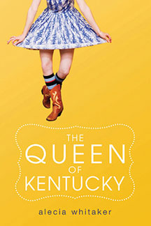
Book Description
Fourteen-year-old Kentucky girl Ricki Jo Winstead, who would have preferred to be called Ericka, thank you very much, is eager to shed her farmer’s daughter roots and become part of the popular crowd at her small town high school. She trades her Bible for Seventeen magazine, buys new “sophisticated” clothes, and somehow manages to secure a tenuous spot at the cool kids table. She’s on top of the world, even though her best friend and the boy next door, Luke, says he misses “plain old Ricki Jo.” Caught between being a country girl and wannabe country club girl, Ricki Jo begins to forget who she truly is: someone who doesn’t care what people think and who wouldn’t let a good-looking guy walk all over her. It takes a serious incident out on Luke’s farm for Ricki Jo to realize that being a true friend is more important than being popular.
This YA book is about a young girl who is coming of age and trying to figure out who she really is. (Read book description above.)
Now, let’s break down the components of this book cover to see what’s working and what’s not:
Title: The title, The Queen of Kentucky, is unique and witty. Just as importantly, the title works with the imagery instead of against it.
Images: The designer could have used clip art of a queen’s crown, but this would have likely confused the reader. Instead, the designer used an unexpected and interesting image to engage the reader. The image is supporting the title in a very subtle way in that the character is doing a proper, little curtsey. (That’s how the royals like it.) This cover design also makes exceptional use of color, fonts, and placement of elements.
Promise: This front cover design and back cover description make an accurate promise of what the reader can expect from the book: a fun, relatable, and slightly irreverent story about a young teen trying to figure out who she really is.
Market Reach: This cover reflects that the designer has a clear picture of the intended market. The imagery and overall tone of the cover reminds us of most young teenage girls: a little quirky, awkward, and if you think about it, slightly sarcastic and rebellious.
Quality: The quality of this cover suggests that the quality of the writing is just as good. The uniqueness of the cover suggests that the writing is just as unique. Readers will feel more inclined to spend their time and money on this book because they feel they have some assurance of quality.
Now that we’ve examined these book covers and book descriptions, ask yourself: What is it about a book cover that engages you? What is it about a book cover that gives you a clear idea of what the book is about—what it promises? What is it about a book cover that assures you of its quality? For the most part, your conclusions are your market’s conclusions.
“Everything about your cover (from title and imagery to book description) should clearly indicate what the reader should expect from reading your book.”
As you (or your book designer) set out to create your book cover, consider these keys to making your book cover what it should be—a powerful sales tool.
1. Visually Engage the Reader
Your cover’s title and imagery should make the reader stop and take notice. Let your title make an impact and pique enough interest to make the reader want to know more. The imagery can be beautiful, strange, intense, peaceful, symbolic, funny, or scary—as long as it accurately reflects the tone and content of your book. Don’t hang on to a title or imagery just because of your own personal preferences. Get feedback. Look at competing books. Be realistic about whether your title or imagery is what it should be. If it’s not going to help sell the book, get rid of it and start again.
2. Speak to Your Market
Most book genres adhere to certain cover styles that fans of the genre are familiar with and more readily identify with. If, for example, you use bright colors and cute curly fonts for your horror fiction novel, there will likely be a disconnect between your book and its intended market. Examine other books in your genre, and make note of the similarities in design. Look at the imagery, fonts, colors, titles, and book descriptions. Let your cover adhere to what your market expects—because it works.
3. Make the Promise
Everything about your cover (from title and imagery to book description) should clearly indicate what the reader should expect from reading your book. This is your promise, and it’s a promise that readers don’t like to have broken.
Make your promise a compelling promise. Let your book description reveal things about your book that are different, maybe better, than similar books. If you can do this, you will set your book apart from its competition. This will strengthen your personal brand and help increase sales.
4. Assure Quality
Everything about your cover should suggest to the reader that you know what you are doing and are able to do it well. Professional packaging (design), reviews, endorsements, awards, a well-written book description are all assurances that you are offering a quality book that is worth the reader’s time and money.
As You Design Your Cover, Ask Yourself the Following:
- Does your title work? Does it have impact?
- Does your cover imagery support your title and story?
- Is your cover design engaging?
- Does your cover design reflect the true tone and content of your book?
- Does your cover design and book description match your promise to your reader?
- Will your market identify with your cover design?
- Does your cover assure quality?
- Have you researched the covers of other books in your genre?
- Have you submitted your cover to others for unbiased feedback?
- When all is done: have you created a basic cover or a powerful sales tool?
If you want an effective book cover, just remember that you are creating much more than a piece of art to wrap around your words. You are creating, element by element, a cover that has just one purpose—to make readers want to buy and read your book.
***

Deana Riddle, CEO and founder of BookStarter, is a veteran trade publisher, publishing consultant, instructor, and independent publishing service provider. She has over twenty-five years of experience in traditional publishing, independent publishing, offset printing, on-demand printing, sales, project management, site management, advertising, and design. As a trade publisher and independent publishing consultant, Deana guides authors and business professionals towards achieving publishing excellence and profitability.
To learn more about Deana or her publishing support services, you can visit her website at https://bookstarter.com.
Deana also teaches two ongoing courses for WOW! Women On Writing: Independent Publishing: How to Start Your Own Self-Publishing Business and Published in 90 Days.
-----
Enjoyed this article? You may also like:
How to Format Your Manuscript for Kindle and NOOK (Including How to Build Your Own E-book Cover)